Big Productions
Big Productions wanted a reboot with a more assertive identity in tune with their name and positioning, completed by a site that echoes this new image. After several weeks of experimentation and exchanges, we finally found a lead that is imposing while retaining a certain finesse articulated by a design system that plays with typographic contrasts and visual scale effects.
- Scope
Logotype, Visual identity, Art Direction, Development
- Front-End Development
- Typography
Futura Now
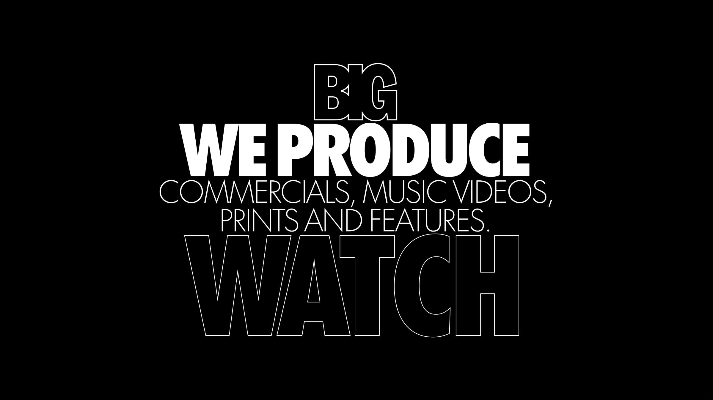
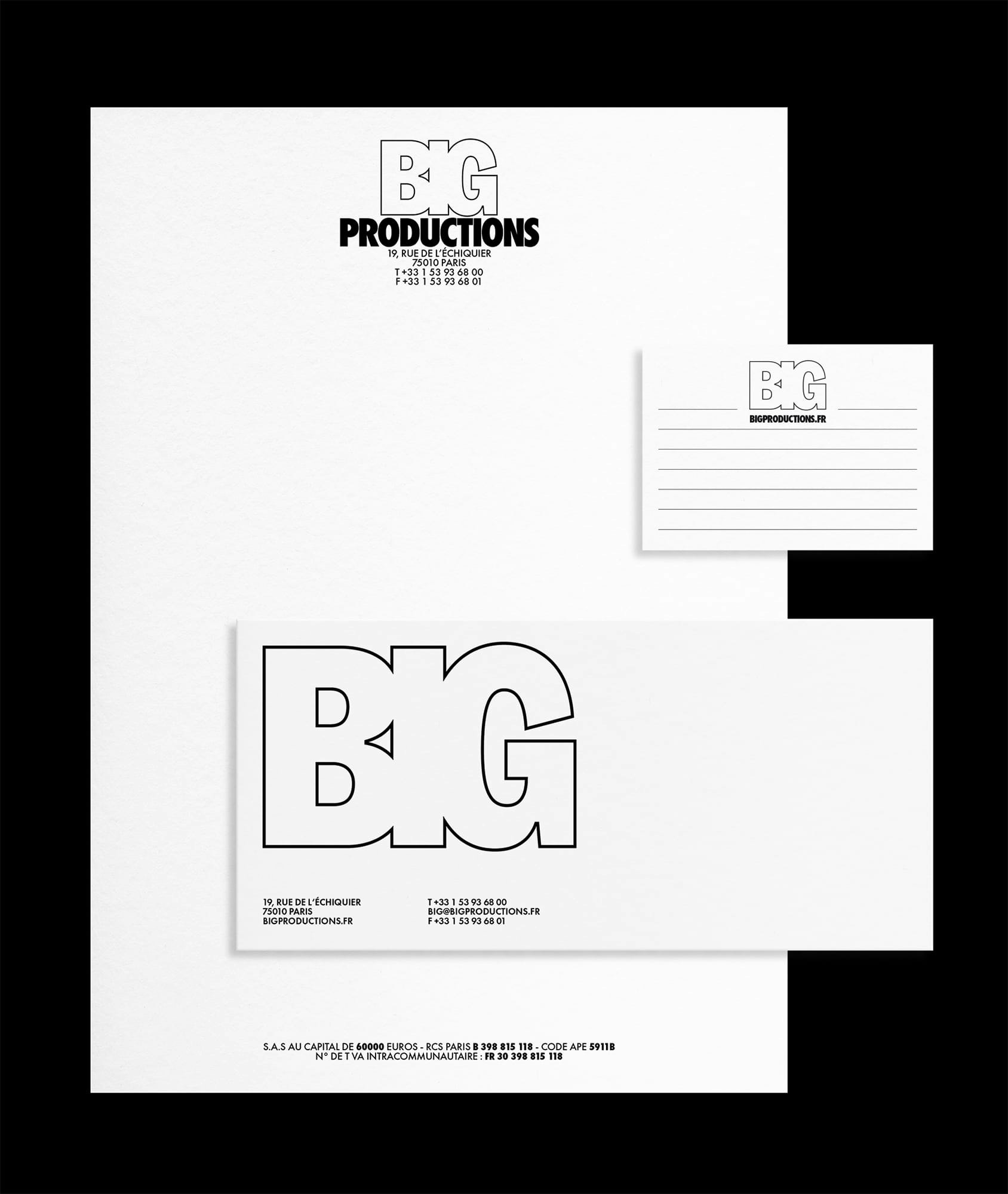
We drew the logo lettering with condensed grotesque families headlines as an inspiration. We then blended them together to enhance the visual mass producing a larger than life look compensated by the use of a stroke. The result is forceful while remaining light.
The amount of control we wanted to have over the headlines kerning led us to develop a tool that allowed us to change the letter spacing directly in the browser and record the result to implement it in the CSS.
We agreed with BIG to keep the navigation as minimal and accessible as possible, however we wanted the interactions to echo the identity work carried out upstream. Thus we created a script that modifies the scale of the thumbnails according to the cursor’s position and applied this principle to image-to-image transitions, viewers and talent page, maintaining a coherent user experience.