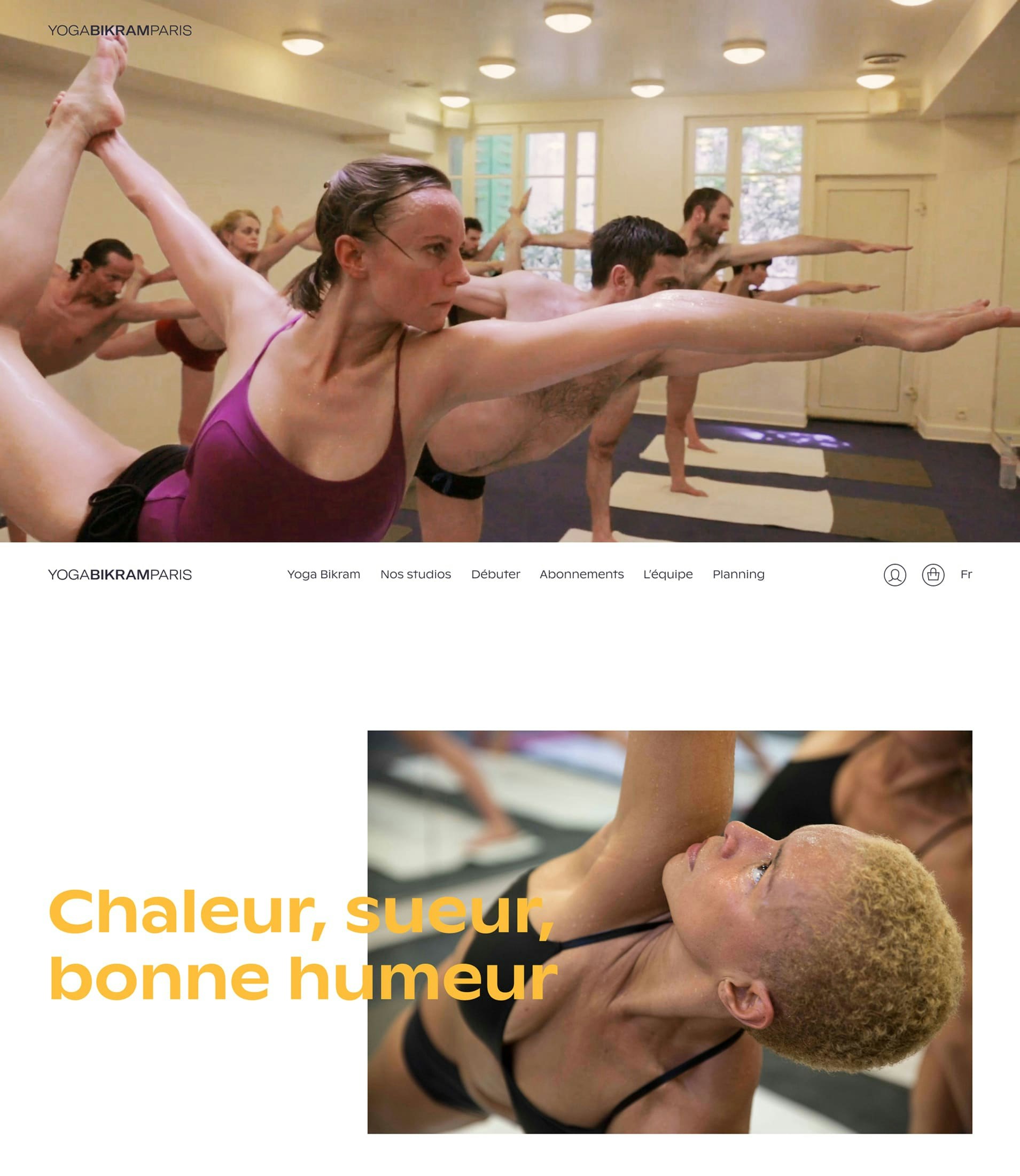
Yoga Bikram Paris
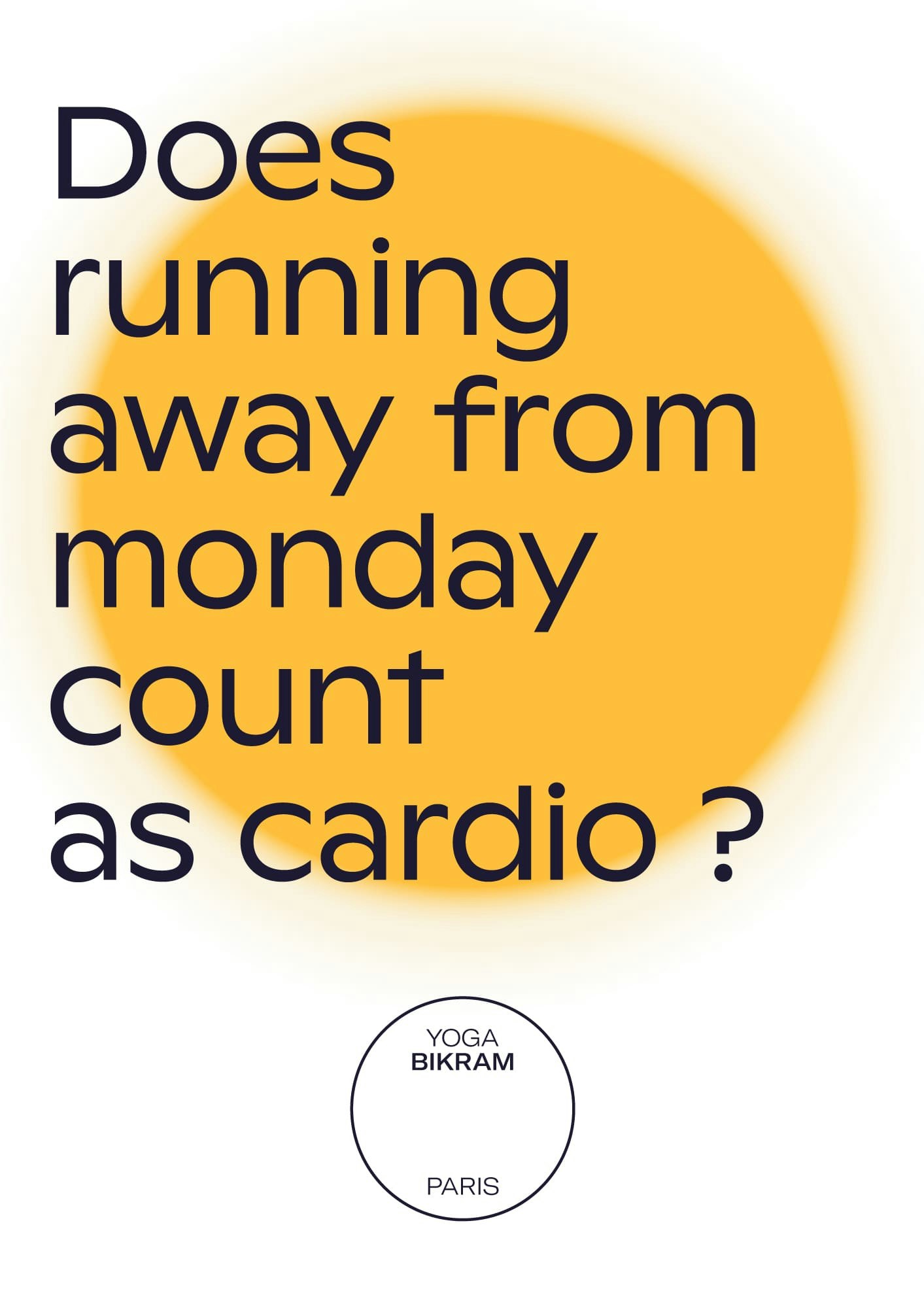
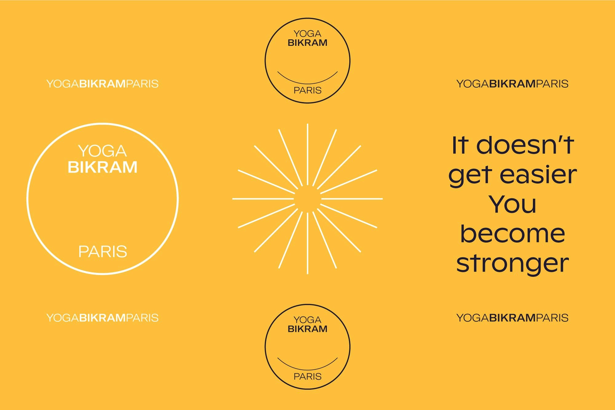
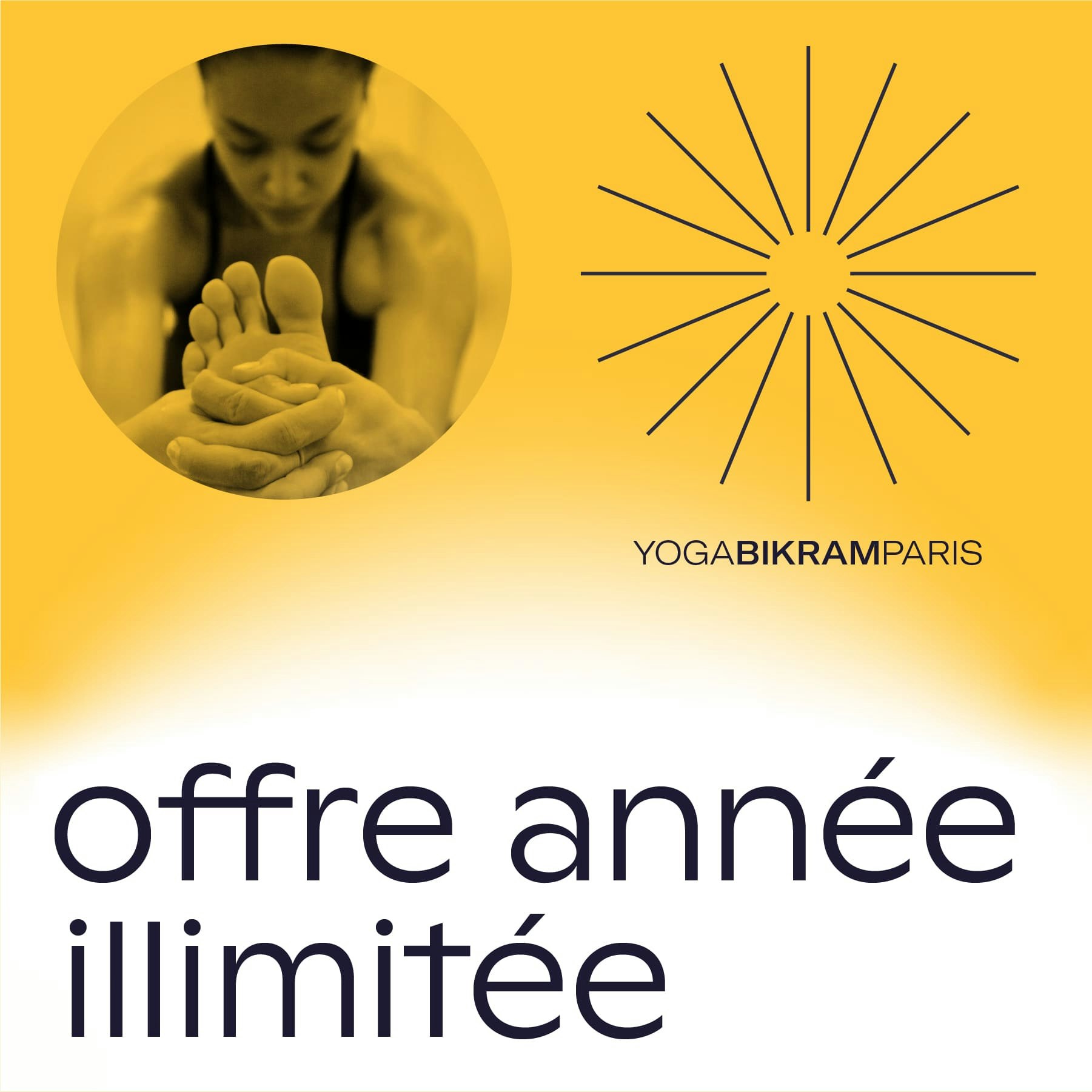
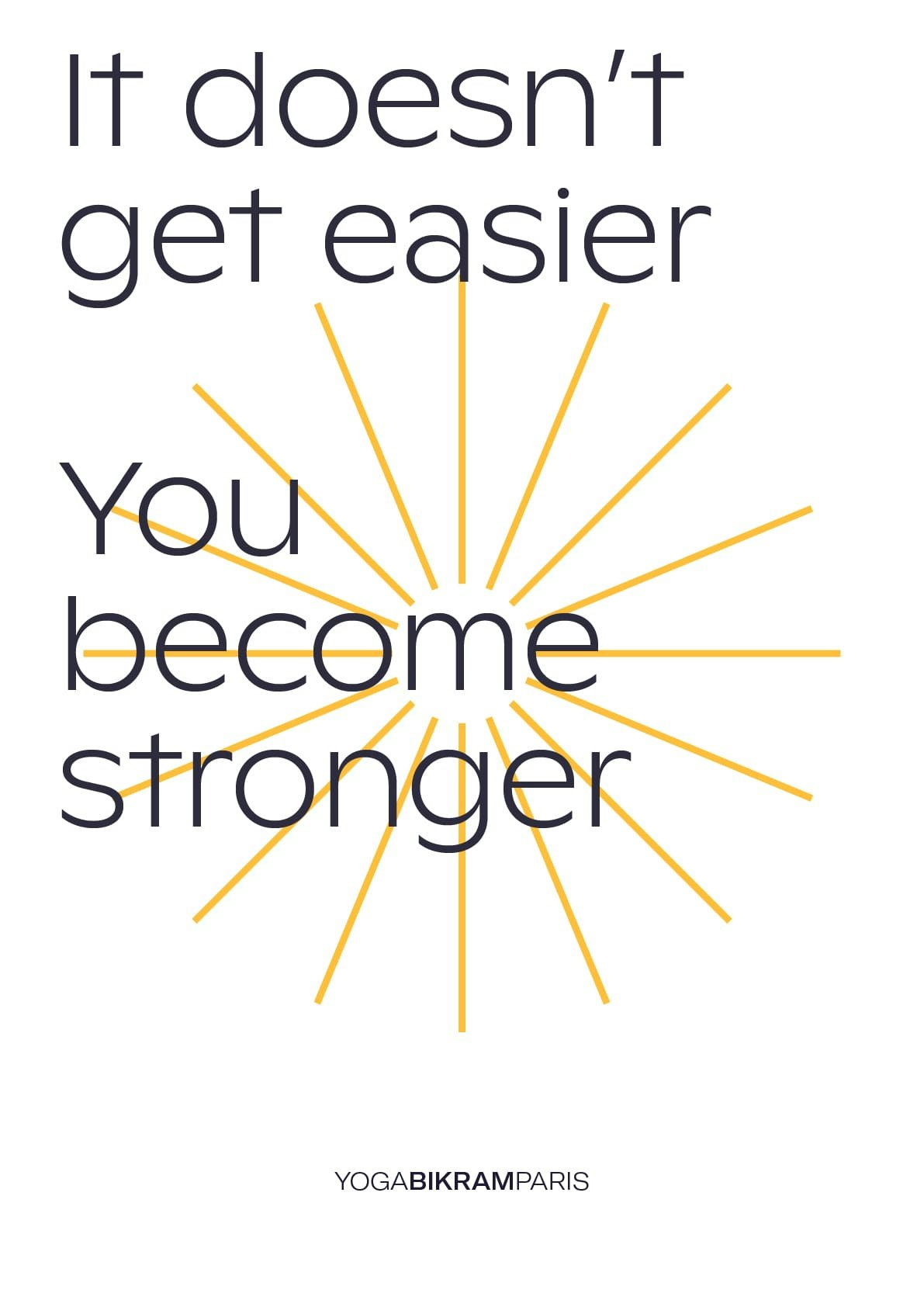
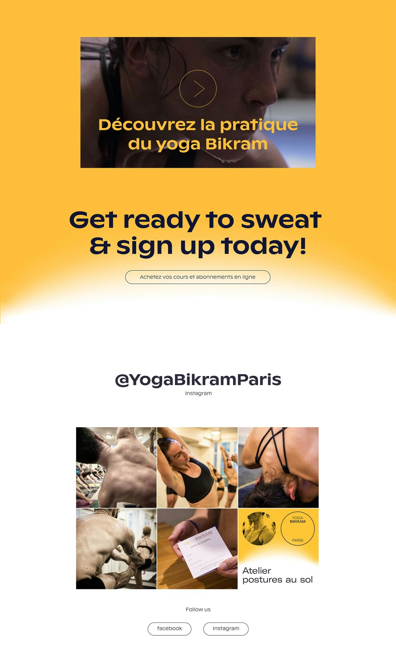
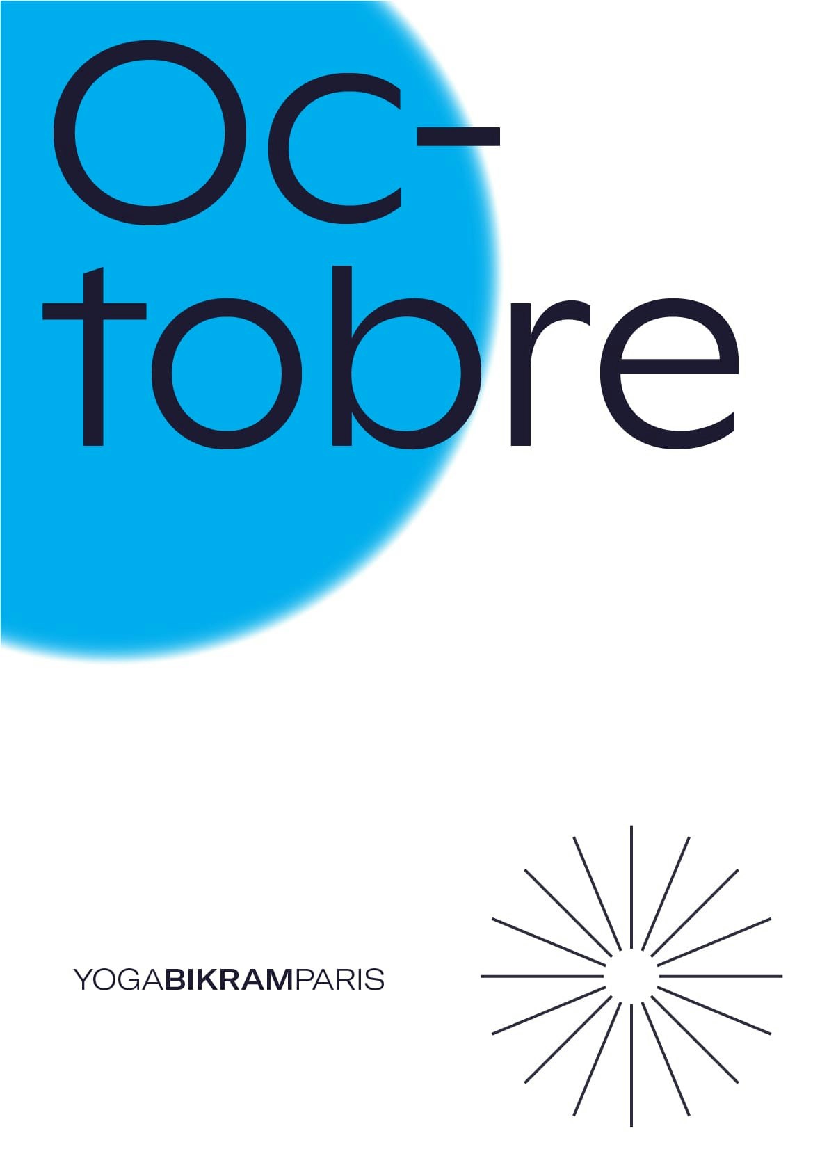
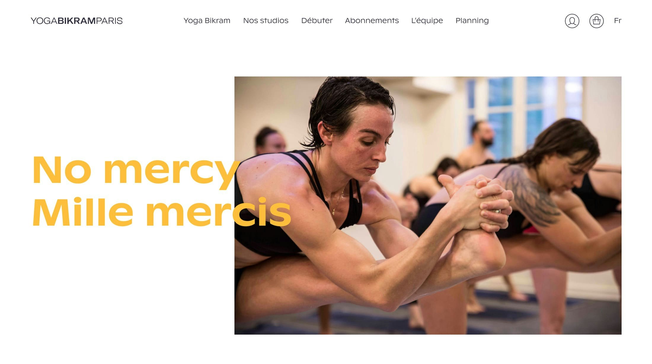
Yoga Bikram Paris asked us to give a fresh, sporty and modern take to their brand. The sun is a traditional sign in yoga already present in their former identity. We decided to give it a playful look as well as adding the use of a gradient to express the specificity of Bikram (being the use of heat). The typography was also chosen to enhance the sporty feel of the brand.
- Scope
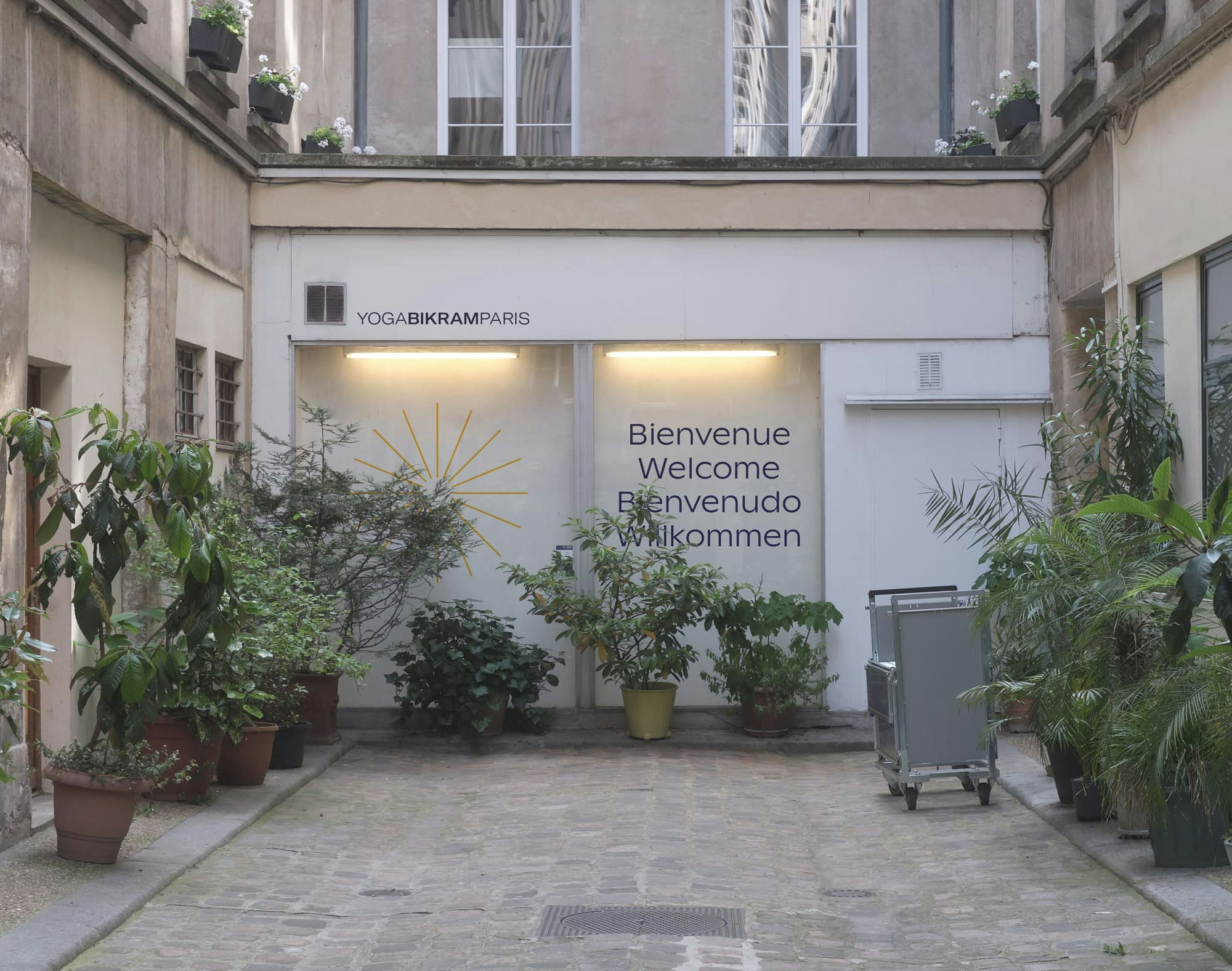
Visual identity, Logotype, Art direction, Webdesign, Signage
